Why a Modern Website Builds Trust and Converts More Visitors
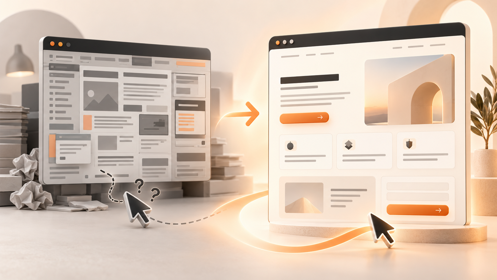
Before a potential customer speaks to you, visits your premises or sees the quality of your work, they often meet your website. In a few moments, they decide whether the business feels current, credible and easy to deal with. That decision is not based on decoration alone. It comes from how quickly the page explains the offer, how confidently it answers doubts and how simple it makes the next step.
Modern website design is therefore not a competition to use the newest visual trend. A useful modern site makes a business easy to understand, trust and contact. When those three jobs are handled well, more of the right visitors can move from interest to a genuine enquiry.
Your website shapes trust before the first conversation
Visitors cannot immediately inspect your service in person, so they use the evidence available on the screen. Consistent design, readable text, current information, useful images and clear contact details all act as credibility cues. Together, they suggest that someone pays attention to the business and will also pay attention to the customer.
The opposite is also true. An outdated layout, conflicting fonts, broken links or vague information can create doubt even when the underlying service is excellent. The visitor may not consciously analyse every problem. They simply feel less certain and continue comparing alternatives.
Stanford's web credibility guidelines recommend professional design, easy verification of information, visible contact details and content that is kept up to date. Appearance is one signal, not a substitute for honesty. A polished site must still be supported by accurate claims, transparent business information and evidence people can check.
Read the original guidance from the Stanford Web Credibility Research project.
What “modern website design” actually means
Modern does not have to mean experimental, animated or minimal to the point of being empty. It means the site works well for the person using it today. The layout adapts to a phone, pages load without unnecessary delay, text is comfortable to read and the visitor can recognise what is clickable.
The visual ingredients are usually straightforward: a limited colour palette, generous spacing, strong contrast, consistent buttons, useful photography and typography with a clear hierarchy. Simple navigation matters more than a clever transition. A service page that answers the right question is more valuable than an impressive effect that delays the answer.
Accessibility belongs in the same definition. Visible keyboard focus, labelled form fields, descriptive link text and sufficient contrast improve the experience for people with disabilities and often make the interface clearer for everyone else too.
Clarity turns attention into action
The first screen of an important page should quickly answer four questions: What do you do? Who is it for? Why should someone choose you? What should they do next? When the answers are scattered across several sections, the visitor has to work before they can decide whether the page is relevant.
Every extra interpretation adds cognitive load. Competing headlines, several equal calls to action and a long menu can make a simple choice feel complicated. The aim is not to remove useful detail, but to present it in the order a customer needs it.
Give each page one primary action. Use button labels that describe the result, such as “Request a quote”, “Book an appointment” or “Get my free audit”. Then build a logical path from a clear promise, through benefits and proof, to that action. Secondary options can remain available without competing for the same attention.
Trust signals reduce the risk of making an enquiry
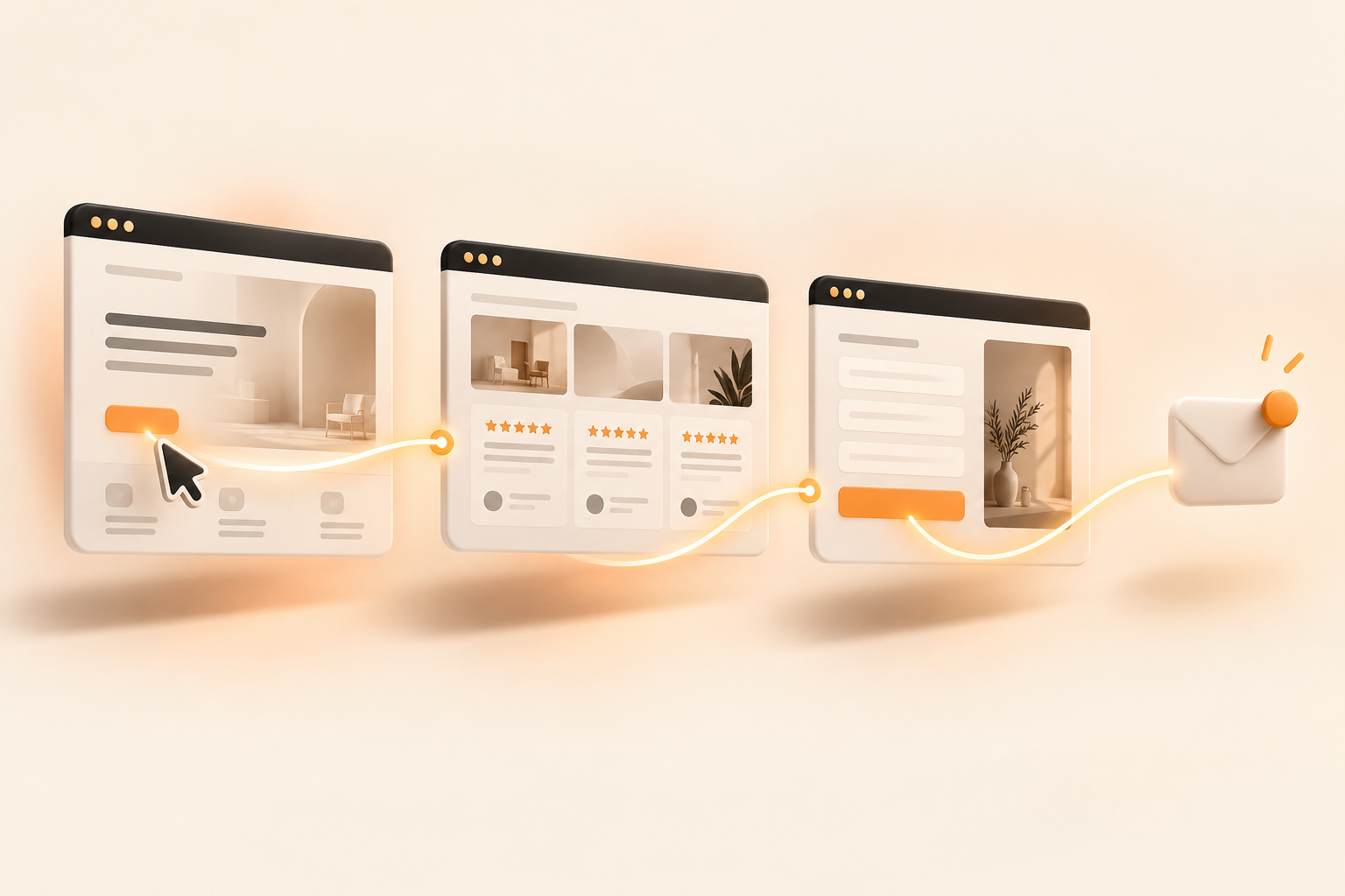
Contacting a new business carries uncertainty. Will they respond? Do they serve this area? Have they handled a similar job? A good website reduces that perceived risk with specific, verifiable information.
Useful trust signals can include:
- Authentic customer reviews with an identifiable source.
- Real examples of completed work or relevant case studies.
- Named founder or team information where it helps the customer.
- Clear service areas, opening hours and contact details.
- Qualifications, memberships or guarantees explained accurately.
- Privacy information and an honest explanation of what happens after an enquiry.
- Recent content and details that show the site is maintained.
Do not hide all of this on a separate testimonials page. Place the evidence close to the decision it supports. A project example belongs beside the related service. A review about communication is useful near the enquiry form. A short explanation of your process can answer the hesitation immediately before a call to action.
Mobile experience is the main experience for many visitors
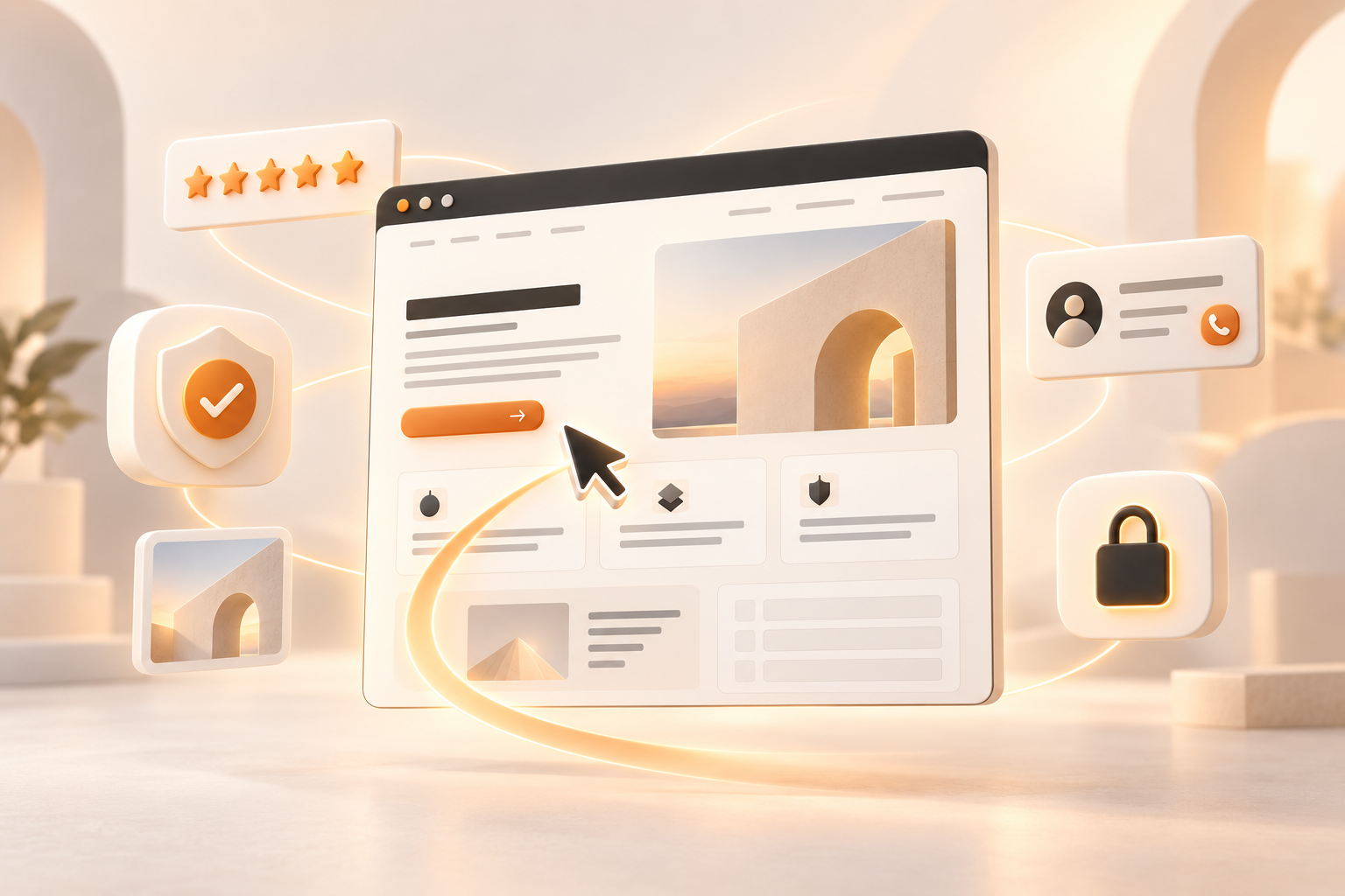
A responsive website is not simply a desktop page made narrower. On a phone, important information should appear in a sensible order, text should be readable without zooming and buttons should be easy to tap. Menus must open and close reliably. Forms should remain usable when the keyboard is visible, and intrusive overlays should not cover the action a visitor came to take.
Google explains that it primarily uses the mobile version of a site's content for indexing and ranking. That does not mean a responsive redesign automatically produces higher rankings, but missing or reduced mobile content can create a real search problem. The same improvements also help the human visitor complete the journey.
See Google's official explanation of mobile-first indexing.
Speed protects both trust and conversion
A slow page interrupts momentum. The visitor has already made one decision by clicking; making them wait creates another opportunity to leave. Delayed buttons, shifting layouts and late-loading banners can also make a site feel unreliable.
Google's Core Web Vitals describe three useful parts of the experience in plain terms: how quickly the main content appears, how promptly the page responds to an interaction and how visually stable the layout remains. They are not the whole of user experience, but they give a practical technical baseline.
Compress images, use modern formats at sensible dimensions, reserve space for media and limit third-party scripts to those that earn their place. Test on an ordinary mobile connection, not only on a fast office computer. You can read the official overview at web.dev Core Web Vitals.
Strong visual hierarchy helps visitors decide
Most people scan before they read. Headings, spacing, contrast and grouping tell them what matters and how the ideas relate. When every line is the same size, every box has a border and every button is bright, nothing feels important.
A practical service page often follows this sequence:
- A clear promise that matches the visitor's need.
- A short explanation of the service and who it is for.
- The most important benefits or service details.
- Relevant proof, such as reviews, work examples or credentials.
- A simple explanation of the process.
- Answers to common objections or questions.
- A focused call to action with clear expectations.
The exact order can change, but the page should feel like a guided decision rather than a collection of unrelated sections.
Consistency makes a small business feel established
Consistent colours, type, buttons, photography and tone make the experience feel deliberate. Visitors learn how the interface behaves and can focus on the offer instead of decoding a new design on every page.
Consistency does not require a large brand manual. A small business can begin with a few clear rules: one heading style, one body font, a restrained colour set, standard button treatments and a recognisable photographic approach. Apply them to every important page, including forms and confirmation screens.
How a modern website can improve conversion rate
A modern website improves conversion by removing avoidable friction. It does not persuade every visitor, nor should it. The goal is to help suitable customers recognise the fit, answer their reasonable doubts and complete the next step.
Clear service pages improve relevance. Genuine proof reduces uncertainty. A short form lowers effort. Visible phone and email options respect different preferences. Helpful validation messages prevent someone losing their work after a small mistake. Each change protects a little of the intent the visitor already brought with them.
Measure qualified enquiries rather than celebrating clicks alone. A higher website conversion rate is useful only when the resulting conversations are relevant to the business. Traffic quality, demand, pricing, the strength of the offer and follow-up all influence the final outcome.
A practical modern website checklist
- The proposition is visible and understandable quickly.
- Each important page has one clear primary call to action.
- Navigation works comfortably on a phone.
- Typography is readable and contrast is sufficient.
- Contact details, service areas and business information are current.
- Images are compressed, correctly sized and useful.
- Relevant proof appears near calls to action.
- Forms request only the information needed for the next step.
- Fields have labels, keyboard focus is visible and errors are understandable.
- Every page has a descriptive title and meta description.
- Links, phone buttons and form delivery are tested.
- Analytics and consent are configured responsibly.
- The site is reviewed regularly instead of being forgotten after launch.
Improve the highest-friction pages first
You do not have to redesign everything at once. Start with the pages closest to an enquiry: the homepage, your main service pages, the contact page and any landing pages receiving substantial traffic. Fix broken contact routes first, then unclear information, missing proof and difficult mobile interactions.
Use analytics and Search Console to understand where people arrive and where they leave. Combine that data with the questions customers ask by phone or email. Real behaviour is a better guide than personal taste.
If people already visit the site but rarely take the next step, use our guide to diagnose why website visitors do not enquire. It will help you check the offer, mobile journey, trust signals and contact routes before deciding whether a complete rebuild is necessary.
Modern design is ultimately about confidence
The strongest website does not merely look newer. It accurately represents the quality of the business, helps visitors make sense of the offer and makes the next step feel safe and obvious. That confidence is built through clarity, proof, consistency and dependable performance.
No design can guarantee more customers. But a clear, credible and usable website can stop unnecessary friction from wasting the attention you already earn.
Is your website helping visitors trust you?
We'll review the pages that matter most, identify the biggest points of friction and show you what to improve first.
Get my free website auditFrequently asked questions
A modern website is clear, fast, mobile-friendly and easy to navigate. It uses readable typography, consistent spacing, restrained colours and an obvious path towards the visitor's next step.
Yes, when the redesign removes real obstacles such as unclear messaging, weak proof, poor mobile usability or difficult forms. Design alone cannot guarantee more enquiries; traffic quality, the offer and follow-up also matter.
There is no fixed schedule. Review it regularly and redesign when the structure, technology or presentation prevents useful improvements, no longer reflects the business or makes the customer journey harder than it should be.
Mobile usability matters because Google primarily uses the mobile version of a site's content for indexing and ranking. A responsive site also makes it easier for visitors to read, navigate and enquire on a phone.
Start with the pages closest to an enquiry: the homepage, main service pages and contact page. Clarify the offer, repair broken contact routes, improve mobile usability and place genuine proof near important calls to action.